Where does the red panda (Ailurus fulgens) live in the wild? How widespread is the eastern grey squirrel (Sciurus carolinensis) outside of New Haven? A new Wikipedia-style project, termed “Map of Life,” aims to show exactly that — and much more. The demo version of the project, developed in part by Dr. Walter Jetz of Yale’s Ecology and Evolutionary Biology Department, will soon combine over 500 million digitized spatial records on species from numerous different data sources, making it one of the most comprehensive spatial biodiversity resources yet. As Dr. Jetz describes it, “the ultimate aim is a public, online, quality-vetted ‘Map of Life’ that for every species integrates and visualizes available distributional knowledge, while also facilitating user feedback and dynamic biodiversity analyses.” The implications and uses of such a resource are innumerable, and it is thought that such an interactive map could eventually aid in understanding the effects of human-caused global change on plants and animals.
A New Method for Mapping Biodiversity
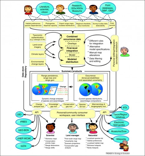
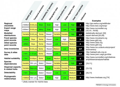
Dr. Jetz defines Map of Life as “a global, collaborative infrastructure for mobilizing, integrating and analyzing spatial biodiversity data.” It strategically incorporates information from a number of sources, including the Global Biodiversity Information Facility (GBIF), the World Wildlife Foundation (WWF), and the International Union for Conservation of Nature (IUCN). These various databases complement, critique, and inform one another, producing dynamic layers of biodiversity distributions overlaid on interactive Google Maps. “Map of Life is more than a sum of its parts; what’s transformational is that these different data types cross-inform each other and help us piece together the most transparent, robust representations of species distribution yet achieved,” Jetz told Nature. The extent of the records is constantly increasing, and the soon-to-be-expanded current demo version supports about 46,000 species, including all described birds, mammals, and amphibians.
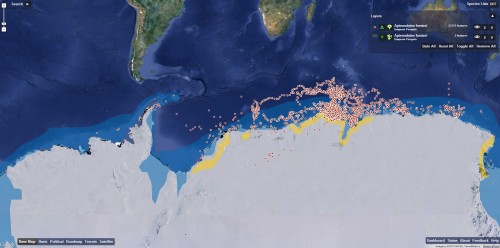
The public demo website (www.mappinglife.org) currently allows users to perform two different operations: mapping species distributions and getting species lists. The first operation allows anyone to visualize the distributions of different species based on the range maps, point occurrences, local inventories, and regional checklists of that species. A series of filters lets you search for species and narrow results by data type and data source. These different layers have varying visual styles to complement and blend with one another. The second function, species lists, allows users to select geographic areas ranging from 50 to 1,000 kilometers and receive a list of all supported species in that range. The results can be filtered by radius and type of animal. Although these functions may seem somewhat rudimentary at the moment, the project is constantly expanding in extent and functions. With hard work over the next few years, this new resource may come out far ahead of any other similar modern tools.
Making the Map a Reality
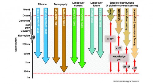
When asked by the New York Times what the inspiration was for the Map of Life, Dr. Jetz cited his days as a Ph.D. student: “As I was running around forests in Africa, I came to the realization that I couldn’t really understand the patterns of species distribution I was seeing without going to broader and broader scales — all of Africa, all of the world.” Jetz stressed the temporal and spatial knowledge, quality, and availability gaps between different types of global-scale data sets on climate, topography, land cover, and species distribution. He and project partner Rob Guralnick proposed the new Map of Life in an attempt to bridge these gaps by incorporating multiple types of data into one simple and cutting-edge public resource. “There is an amazing potential for such a resource to help understand the remaining knowledge gaps and to support the monitoring and analysis of biodiversity change,” Jetz said. His writing outlined the cyber-infrastructure that would support such a resource. Unfortunately, there are no typical federal or agency funding sources for a project of global scope. Nonetheless, this new tool has become a reality with the involvement of Google, NASA, the Encyclopedia of Life Project, and several international research institutions, including the University of Colorado Boulder and the Naturmuseum Senckenberg.
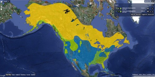
Now that the Map is public, scientists and governments around the world can use the information about the geographic distribution of species to inform conservation efforts and policymaking regarding climate change and even the transmission of zoonotic diseases. In addition to serving these roles, it also helps to expose holes in existing distribution data sets so that future biodiversity research can focus on particular species or specific regions, further developing the Map. However, for the Map to continue to grow it must gain traction in biodiversity circles. As Dr. Jetz told Nature, “the whole idea only works if scientists are keen to engage and contribute to the effort.” He feels there is a good chance the project will prosper because it integrates knowledge in a dynamic format that is accessible to those making decisions about conservation.

The Future of the Map of Life
While some are cynical about the creation of one more type of biodiversity database, Georgina Mace, a population biologist now at University College London is optimistic about the Wikipedia-style approach. The Map of Life developers hope to integrate tools to allow for authorized community input and for the improvement of the data. Such implementations will provide credible researchers and non-scientists the ability to edit existing data and to add new data to the project. Therefore, the distribution maps will be constantly up-to-date and accurate. “Having that dynamic upgrading of the database is really important; otherwise it will stagnate and nobody will believe it any more,” Mace told Nature. Jetz says that more data is on its way. Since its conception in 2012, the database has already increased from 25,000 to about 46,000 species. Further additions lie in the future, including select invertebrates and plants. “If the project continues to grow,” Dr. Jetz told the New York Times, “it could be an invaluable resource five or ten years down the road.”
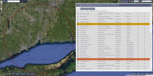
Finally, Dr. Jetz wishes the project could be used for assessing the response of biodiversity to human impacts like land use and climate change, but there is a dearth of data from the past 10 or 20 years, making it very difficult to analyze these effects. As Jetz states, “to date, even much of what we as a society do know remains unmobilized, non-integrated, unquantified and underused.” Strong efforts from the public and from scientific communities in broadening the extent and applicability of the Map of Life may be the next step to understanding and appreciating biodiversity. With these future contributions, perhaps we will finally be able to understand how the interactions between humans and other animals impact the biosphere and the physical Earth we all call home.

About the Author: William Gearty is a junior Geology and Geophysics major in Branford College, with a concentration in Paleontology and Geobiology. He works in Elisabeth Vrba’s lab studying mass extinctions and taxa ranges and in Jacques Gauthier’s lab using CT scans to better interpret fossil specimens and evolutionary relationships.
Acknowledgements: The author would like to thank Walter Jetz for his correspondence, insight, and enthusiasm regarding the Map of Life project.
